Communicating CPC’s Seasonal Forecasts: It’s Complicated
Many of us have seen the seasonal outlooks issued by the Climate Prediction Center (CPC) forecasters. These predictions are extremely important to those who have to make choices based on temperature and precipitation, such as natural resource managers, farmers, and ranchers. But there is a lot of information in the shading and numbers on these maps, and it’s not always clear what it all means. For example, the three-month temperature outlook for August-September-October 2011 (Figure 1), shows red shading, accompanied by an ‘A,’ across much of the northeast and southern U.S., a ‘B,’ and blue shading along California’s coast, and a bunch of ‘EC’s across the rest of the country.
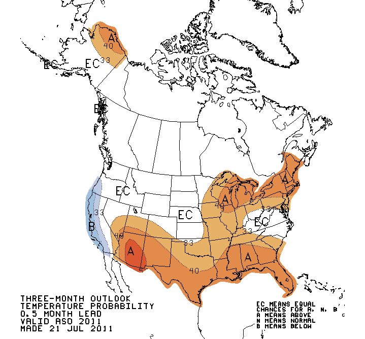
CPC's three-month temperature outlook for Aug-Sept-Oct 2011. Image credit: CPC
Here’s an example of how your average (non-CPC forecaster) might interpret this map:
the red areas (which are denoted with an ‘A’) will have above-average temperatures—the redder the values, the warmer it is predicted to be. The blue areas, inscribed with a ‘B’, will have below-average temperatures, and the white areas will have ‘average temperatures.
But that’s wrong. Here’s what it really says: across most of the southern and eastern U.S. there is a 33% to 60% chance that temperatures will be similar to temperatures experienced in the ten warmest years from 1981-2010. Along the coast of California, there is a 33% to 50% chance that temperatures will be similar to temperatures experiences in the ten coolest years from 1981-2010. In much of Arizona, there is a 50%-60% chance of having temperatures will be similar to temperatures experienced in the ten warmest years from 1981-2010 (lucky us, I know we all crave really hot temperatures right as ‘fall’ starts in southern AZ). Across the rest of the country, there are equal chances (EC) of having above-, below-, or near-normal temperatures.
Why does it all sound so complicated? I’ll try to break it down.
The reason for the confusion is that the CPC works in terciles, which means dividing your dataset into thirds. Their baseline datasets of average climate (temperature and precipitation) extend from 1981-2010 (see Peck’s previous post about shifting normals). Temperature and precipitation over this 30-year period define the climate of a region, and are both divided into the ten years with the highest values, 10 years of the lowest values, and the ten years in between— “near-normal” years.
CPC forecasters find this tercile system useful because it’s a good way to break down the data (they could just as easily halve the data) and report probabilities of above and below normal temperature and precipitation for regions with very different climates (for example, high elevation Mt. Lemmon, and the city of Tucson in the adjacent valley).
But in this system of dividing up average climate, there is not a single, ‘average’ value for, say August to October temperature. Thus, when presenting their temperature forecast for the next three months, the CPC forecasters have to describe the chance that temperature will be like temperatures in upper tercile (10 warmest years) or like temperatures in lower tercile (10 coolest years). OK. Here is complicating factor #2: Probabilities have to sum to 100%, and as CPC forecasts go, there is almost always some chance that temperature or precipitation will be “near normal.” For example if there’s a 40% chance of above-average temperature, there’s also a 33.3% chance of it being near normal, and thus also a 26.7% chance of having below-normal temperatures. The table in Figure 2 helps illustrate how this works.
So even though a 40% chance of above-average temperature sounds pretty likely, there’s still a greater (60%) chance temperature will be near normal or below average.
And finally, what’s up with “equal chances”?
We typically don’t see any regions forecast to have “near-normal” conditions on these maps. That’s because forecasters don’t make predictions if they don’t have forecast skill. That is, if there is disagreement, or if the forecast is unclear for some reason, there is an equal chance that a region will have above-, below-, or near-normal temperature and precipitation.
But wait, what’s this: On the CPC website there is a link to an experimental two-class forecast. Does this mean the CPC is planning on moving away from their tercile system? In this case, if we look at the same August-September-October temperature outlook, we still see ‘A’s, ‘B’s, and ‘EC’s, but in this case, the contours are indicating the percent chance that temperatures will be like those in the 15 warmest or 15 coolest years from 1981-2010. So, in this case, there is a 70-80% chance that southern Arizona will have temperatures as warm as the warmest 15 years from 1981-2010, and a 20-30% chance that temperatures will be as cool as the 15 coolest years from 1981-2010. Seems a bit more straightforward to me!